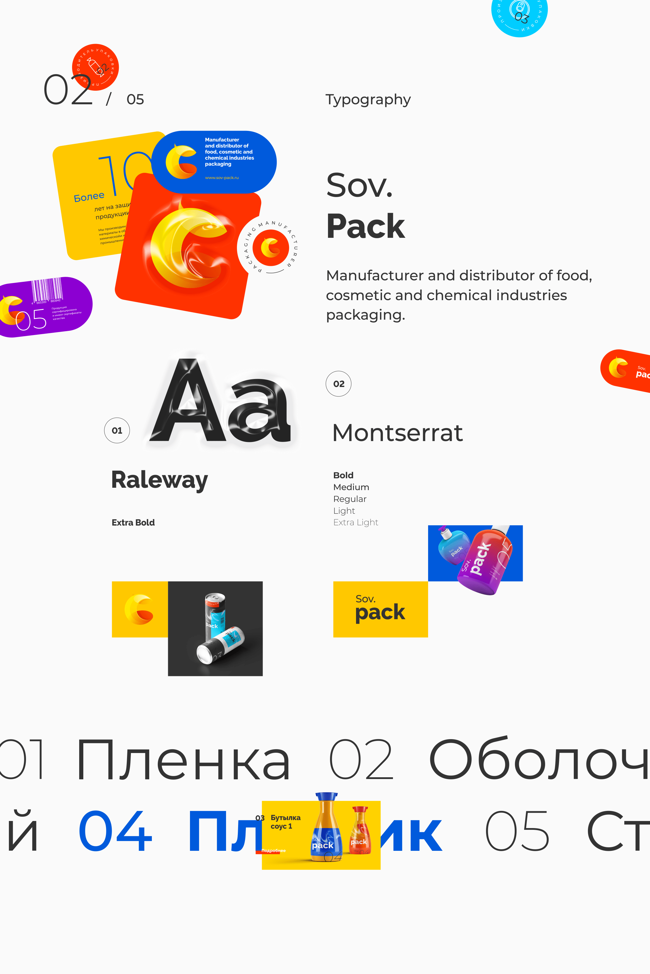
Sov. Pack
About
Sov.Pack is manufacturer and distributor of food, cosmetic and chemical industries packaging.
For years, the company has helped give prominence to their partner's products among a number of competitors, by implementing state-of-the-art technologies in its production process. Original packaging solutions, conceptual design, customized products and high-grade printing of any type are our distinctive features in the Russian market.
Task: To design a new image of the company, to provide Sov.Pack with unique, fresher and more modern look by logo re-designing, to make a promo website of the company. To present the company's products according to the new concept.
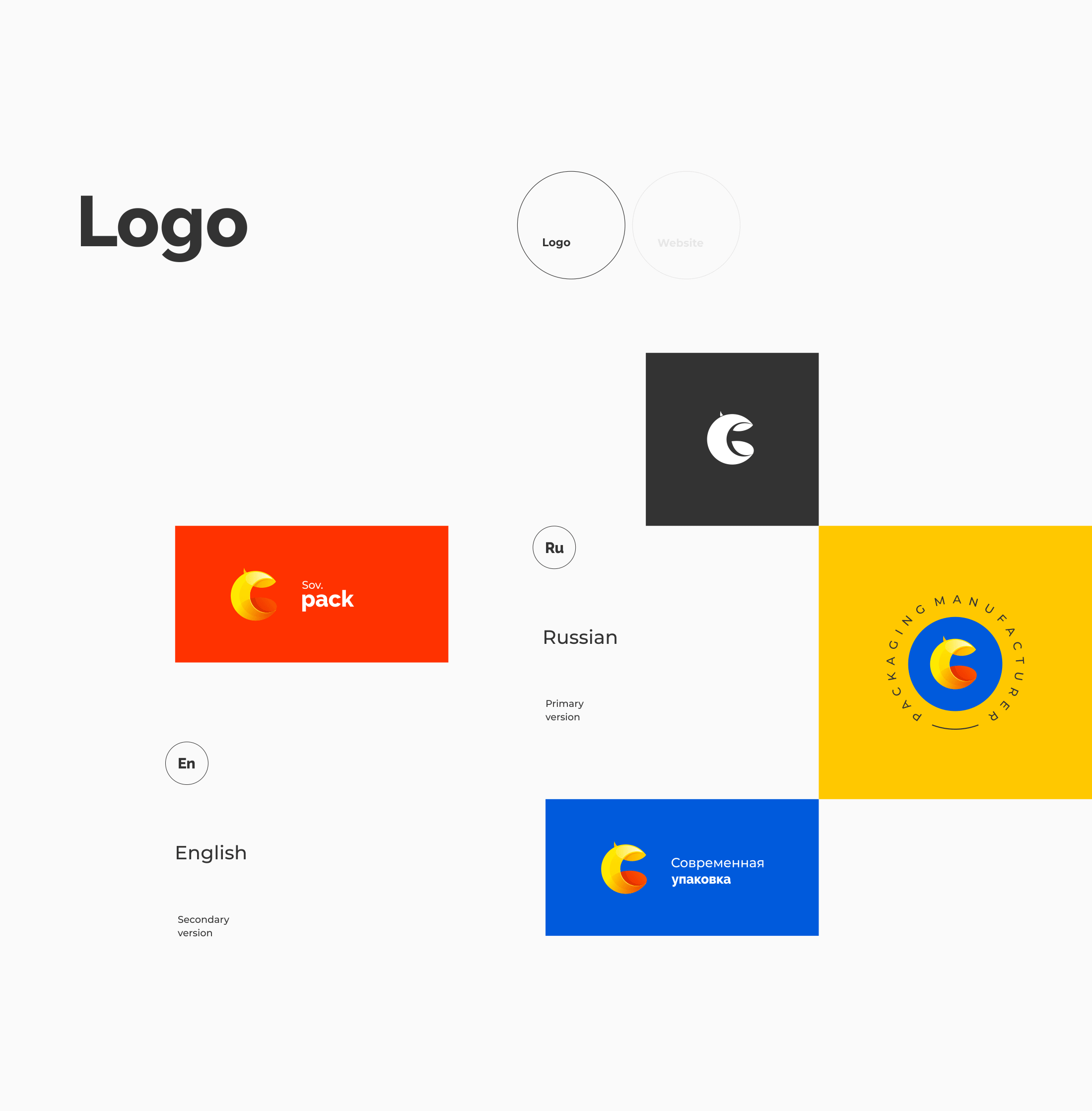
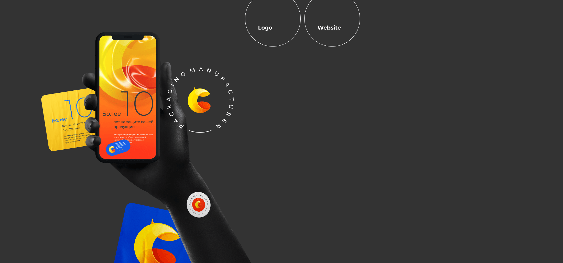
The idea of the logo is simple: it should be based on the capital «C» from the Russian name of the company. It will be three-D, glossy and color-saturated, to resemble packaging materials. It will be bright, slightly playful and flexible, moving away from conservative templates of the industry. We will create a noticeable and recognizable mark in the packaging sector.
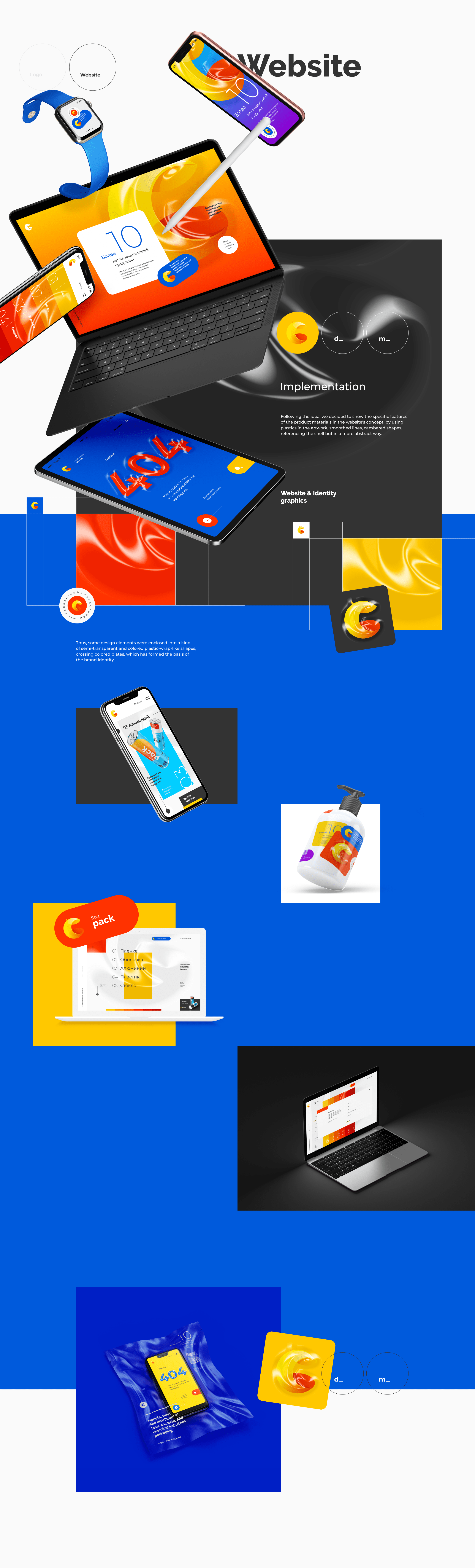
Moreover, the idea of the mark formed the basis for the concept of the company's promo website, by providing it a new makeup, fresh look and sense.
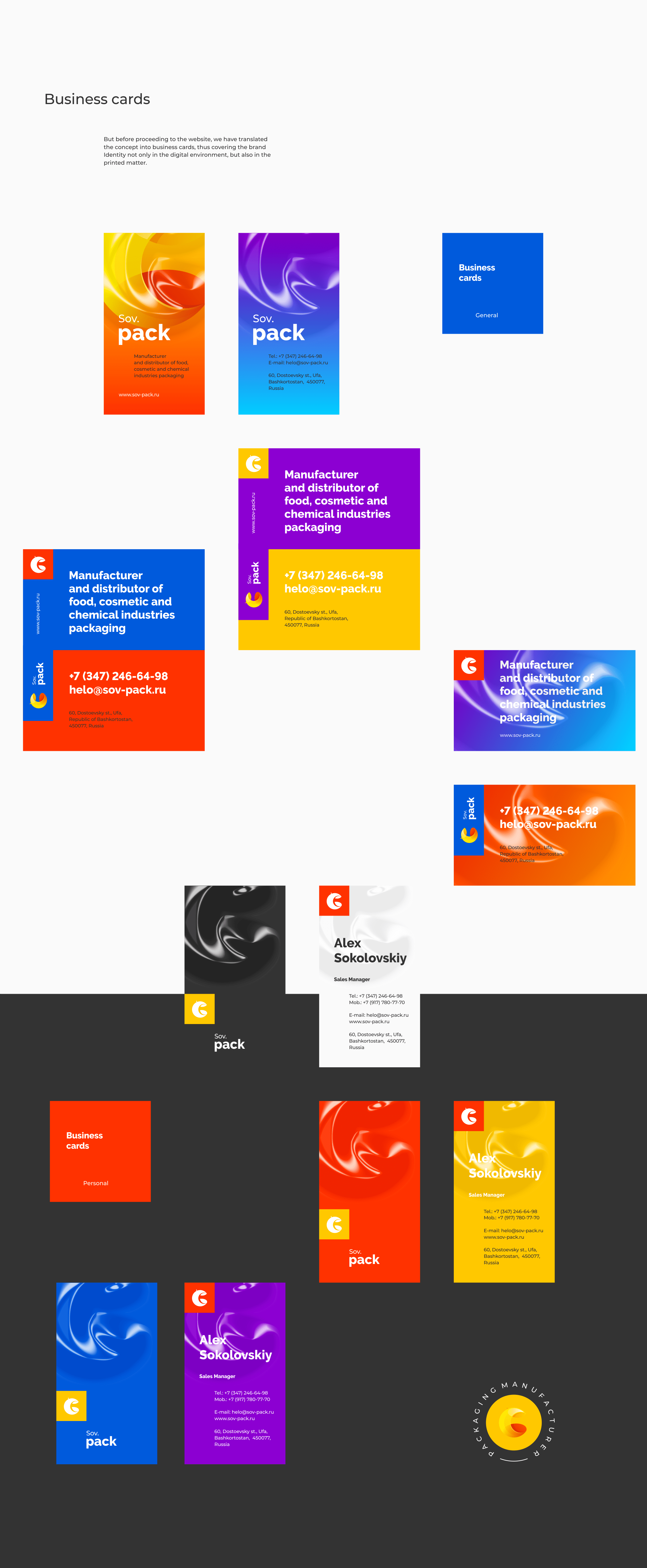
We wanted primarily not to make just a website, but to develop the brand identity, to create the company's look based on the promo site, by providing it with unique visual features. To make a conceptual and sense-bearing product, to incorporate an idea. Not just a superficial idea which would be an open declaration of the company's business. This would be the simplest, the stalest, and, therefore, the least interesting identity option. But a finer idea, creating a intuitive message evoking associations among the public implying the company's belonging to the industry. To create a state-of-the-art, colorful, and user-friendly resource reflecting the brand's distinctive features. To some extent, to move away from the templates of the business, thus standing out against competitors.

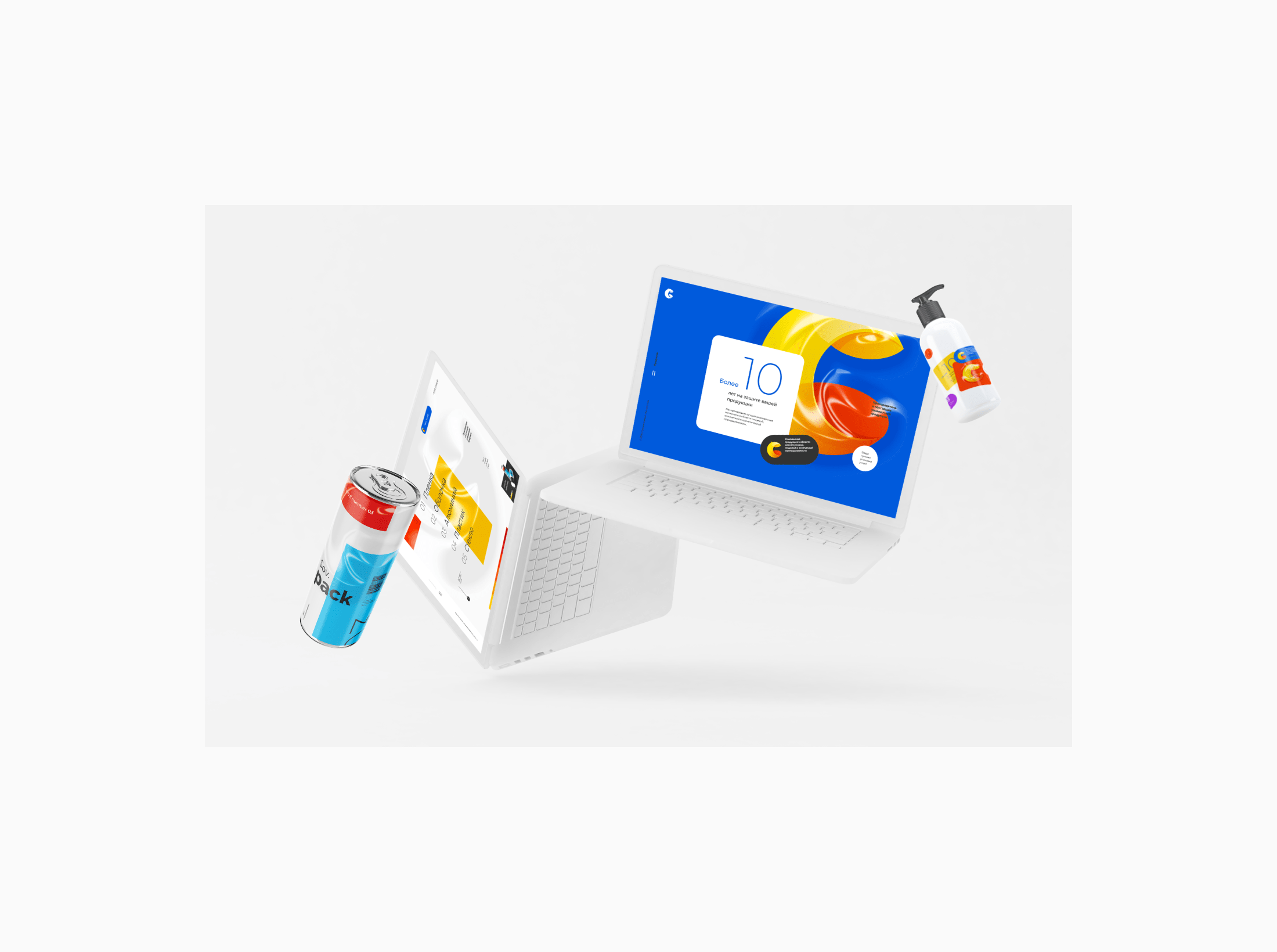
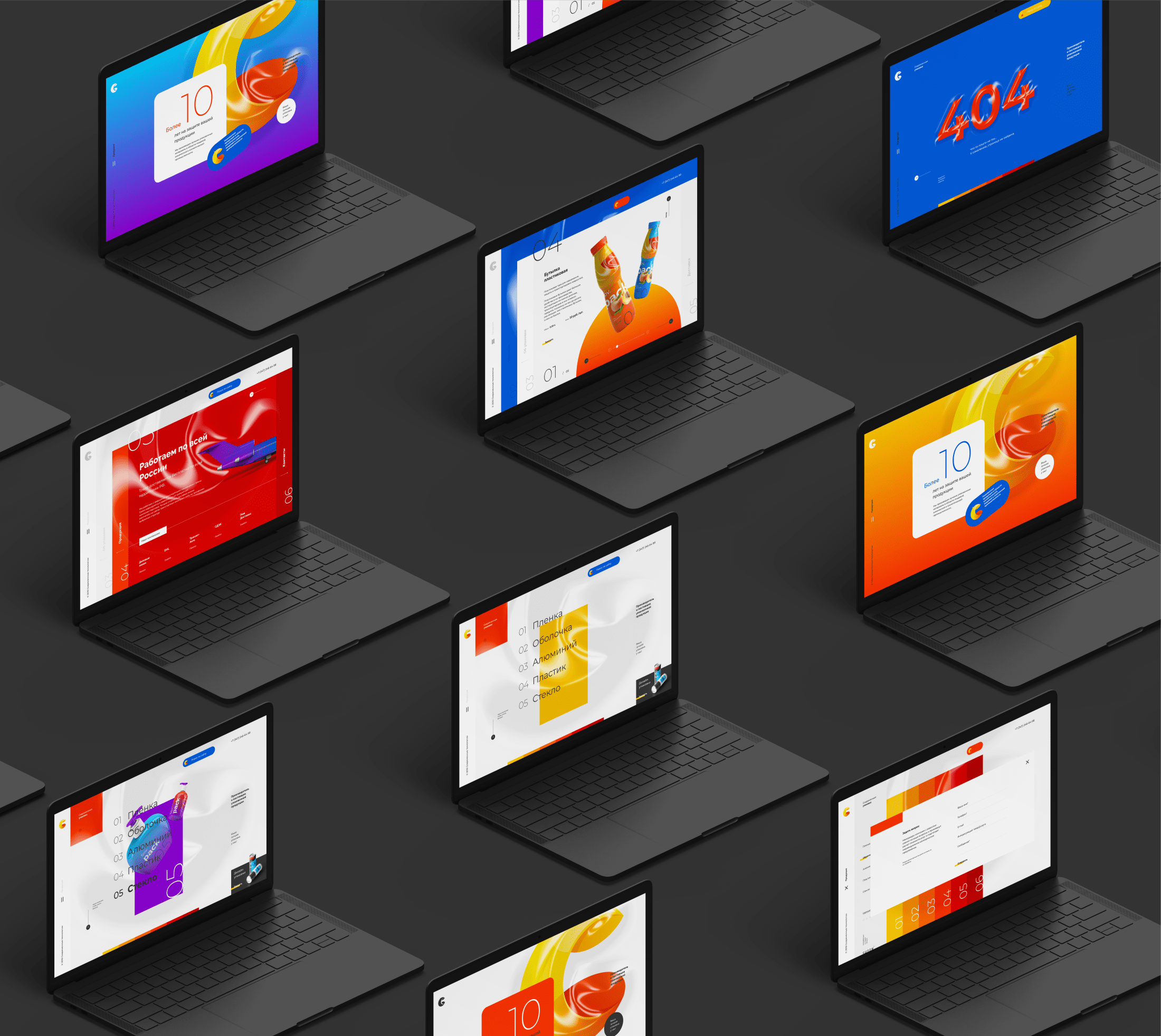
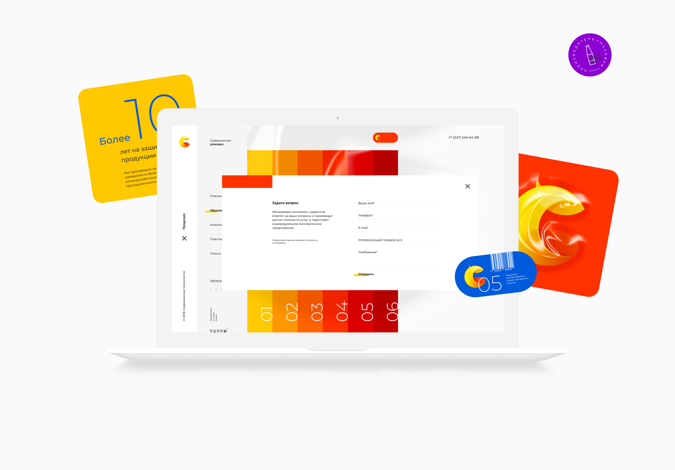
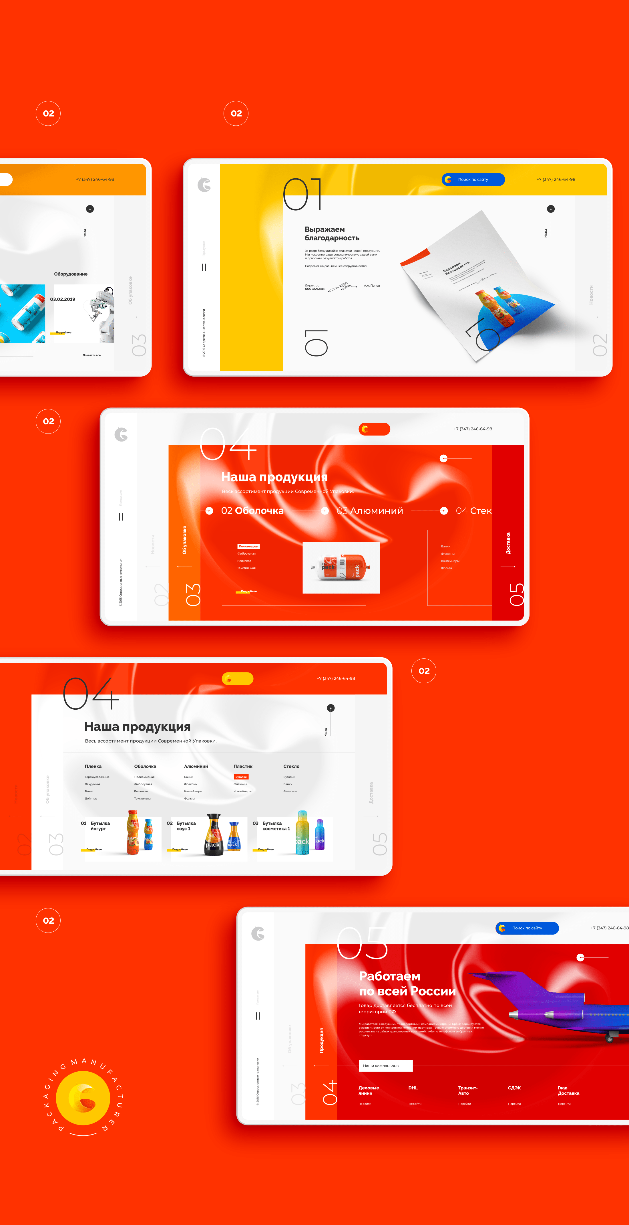
As the main mission of any website is the presentation of the company's services and products, we have focused on these two elements, by segregating them visually and functionally.
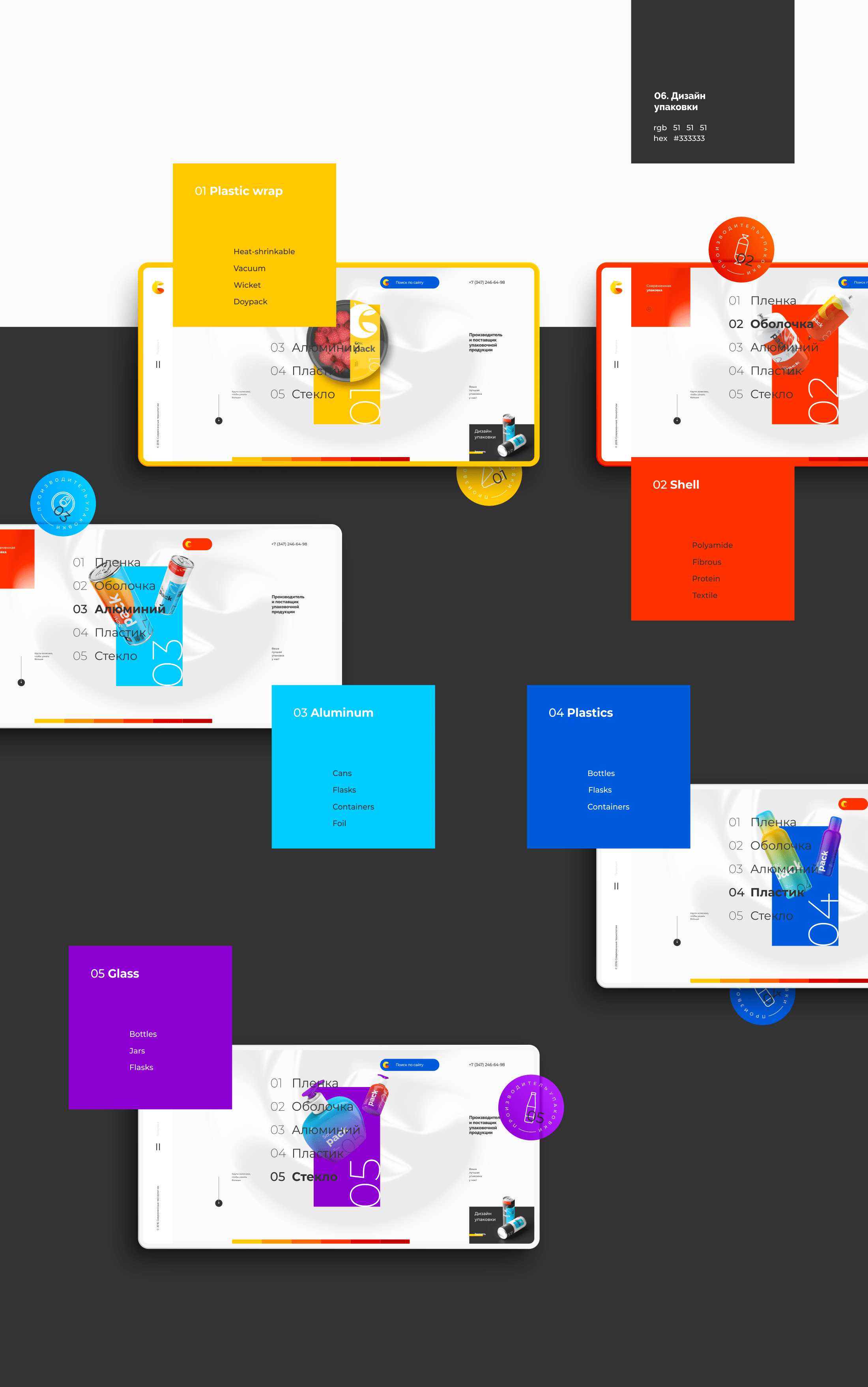
Thus, we have brought the Products section to the foreground, demonstrating its key categories in the slider and in the main menu.
Information about the company and its business has formed an accessory section, provided with an interactive menu incorporating sliding bars.
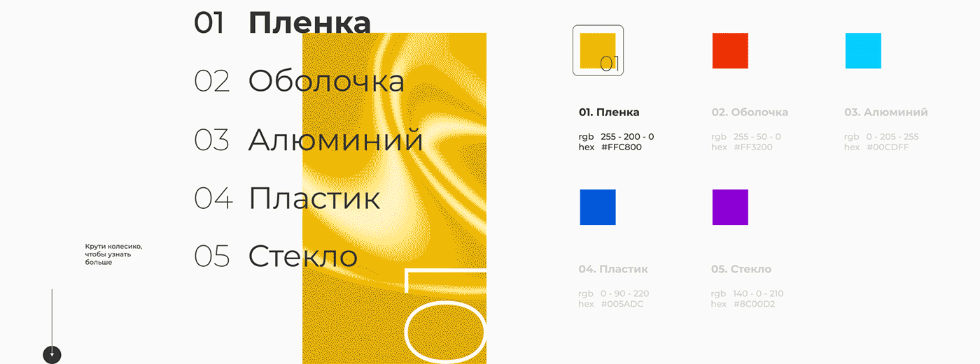
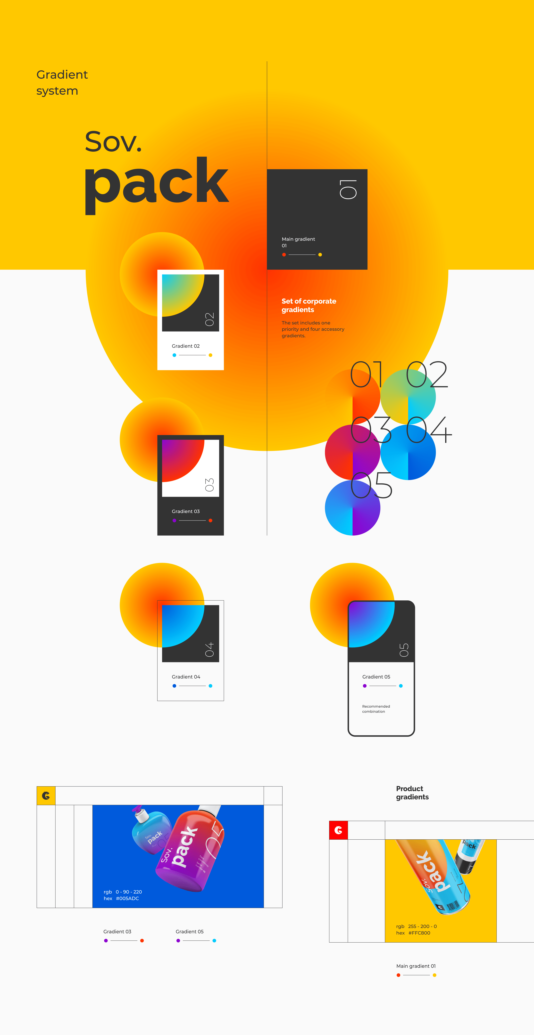
Along with identity graphics, we have designed a corporate palette featuring an internal system of colors and gradients.
The array is quite rich but still limited. This way, we wanted to show the variety of the company products, to translate the friendly and positive attitude of the brand, by providing each of its areas with a distinctive color.
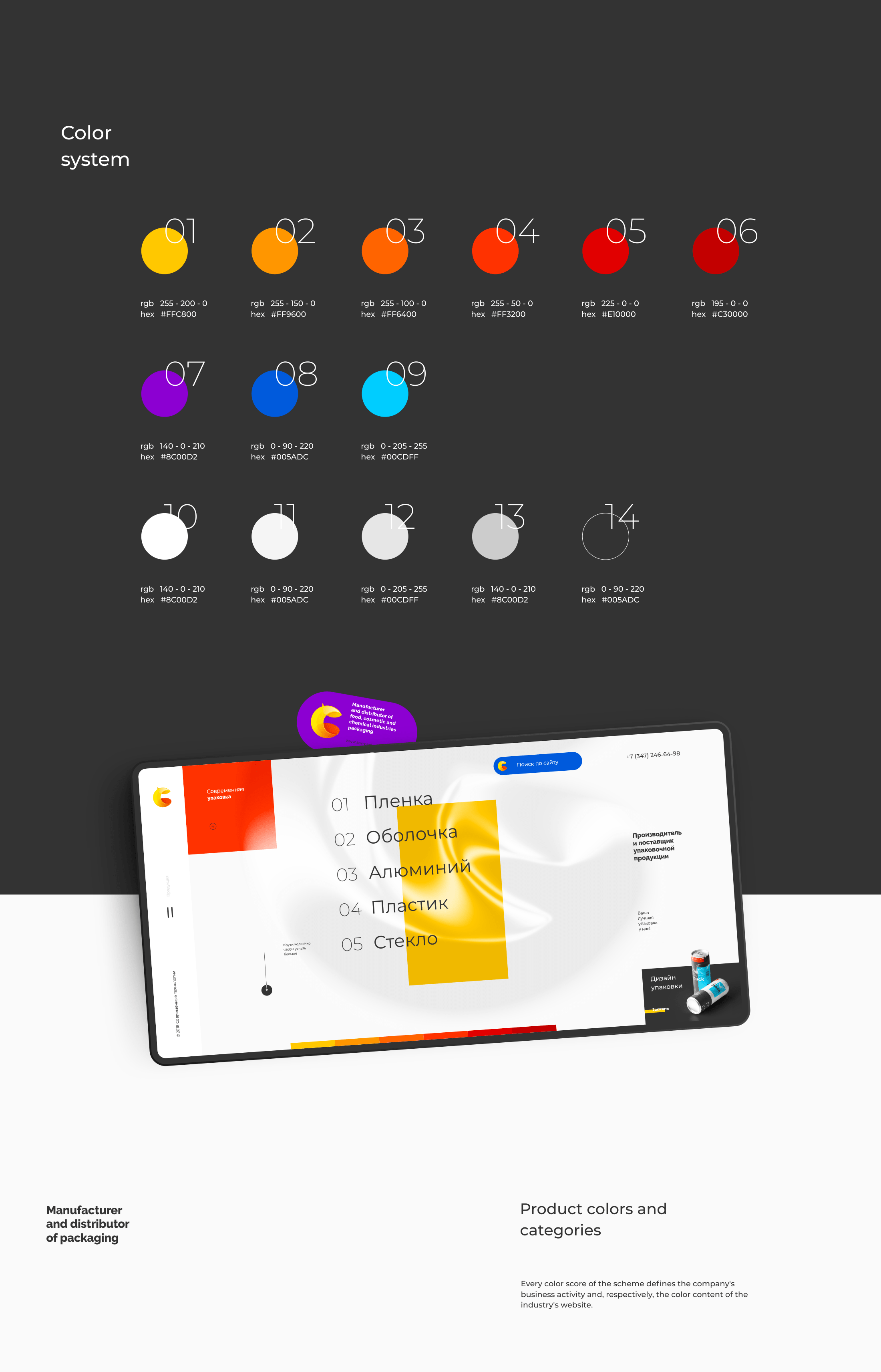
The system of brand-related gradients is not less important for the brand identity. It is based on corporate colors but, unlike them, the gradients do not define the belonging to any business sector of the company, instead, they are of auxiliary nature only, being a supplement to main brand colors.
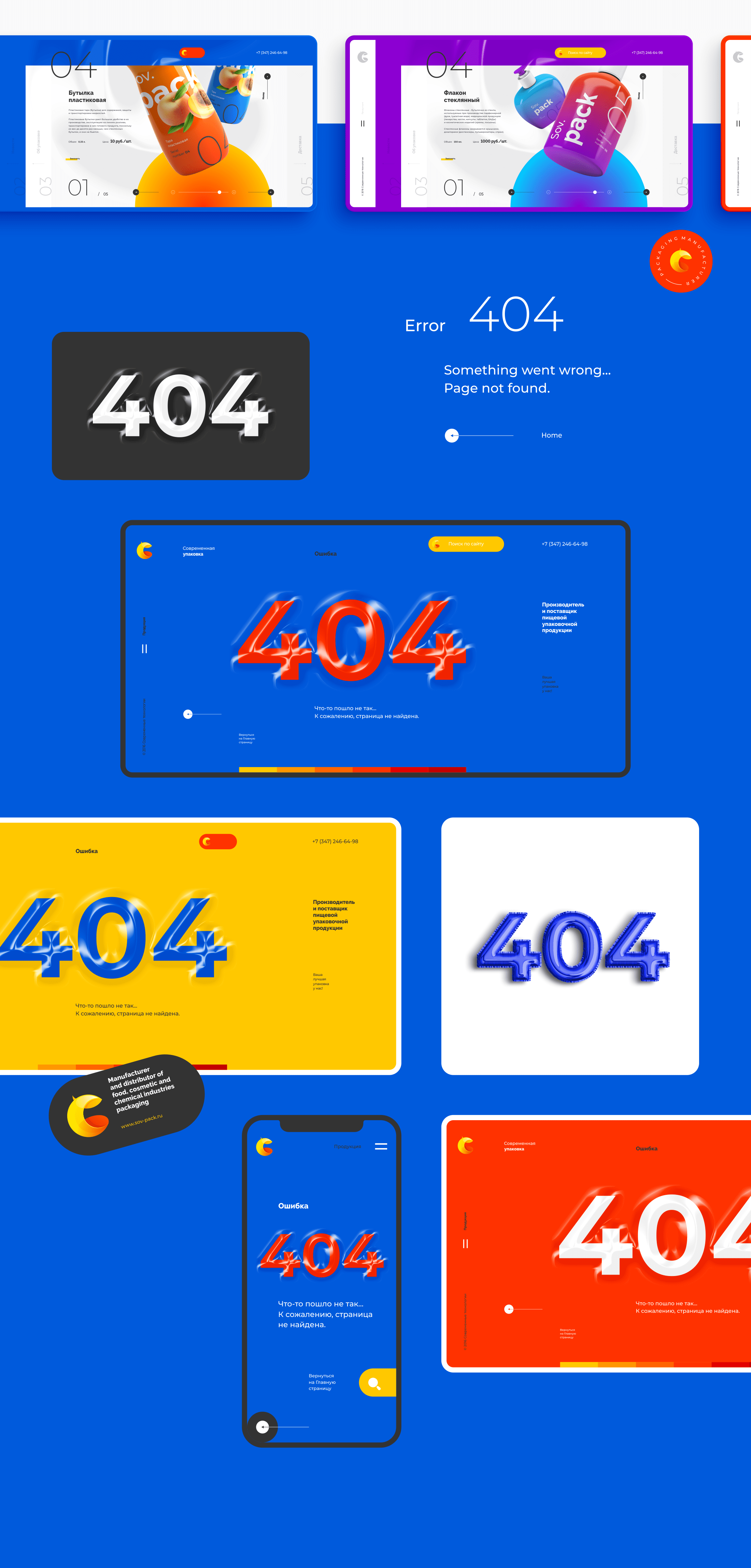
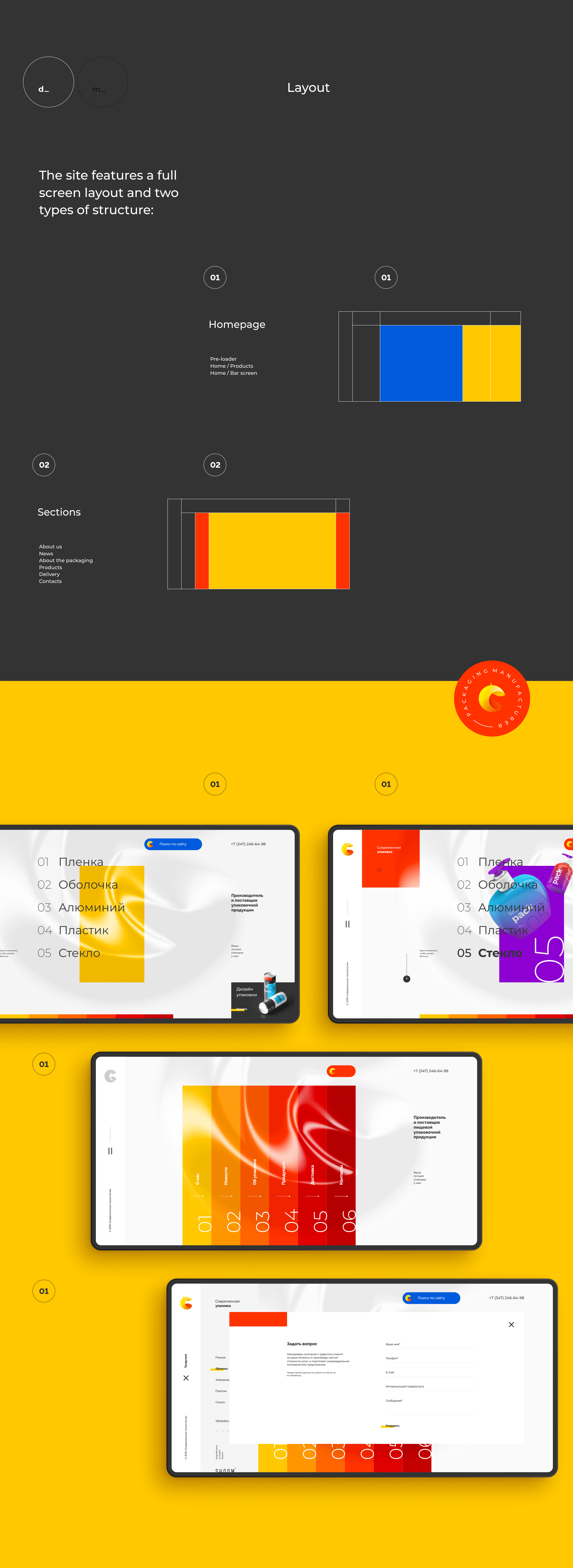
We have adapted the corporate website's concept, dynamics and structure to the mobile version, without impairing the main idea and the brand identity.
The mobile version preserves the functionalities and operating principles of the website. But, unlike the desktop version, sliding menu bars are oriented horizontally, which provides vertical dynamics to the adaptive version.
We have developed a new image of the company, provided the Sov.Pack brand with a unique, fresher and conceptual look by redesigning its logo and by developing its promo website, thus giving prominence to the product in the market against a number of competitors.
for watching!

