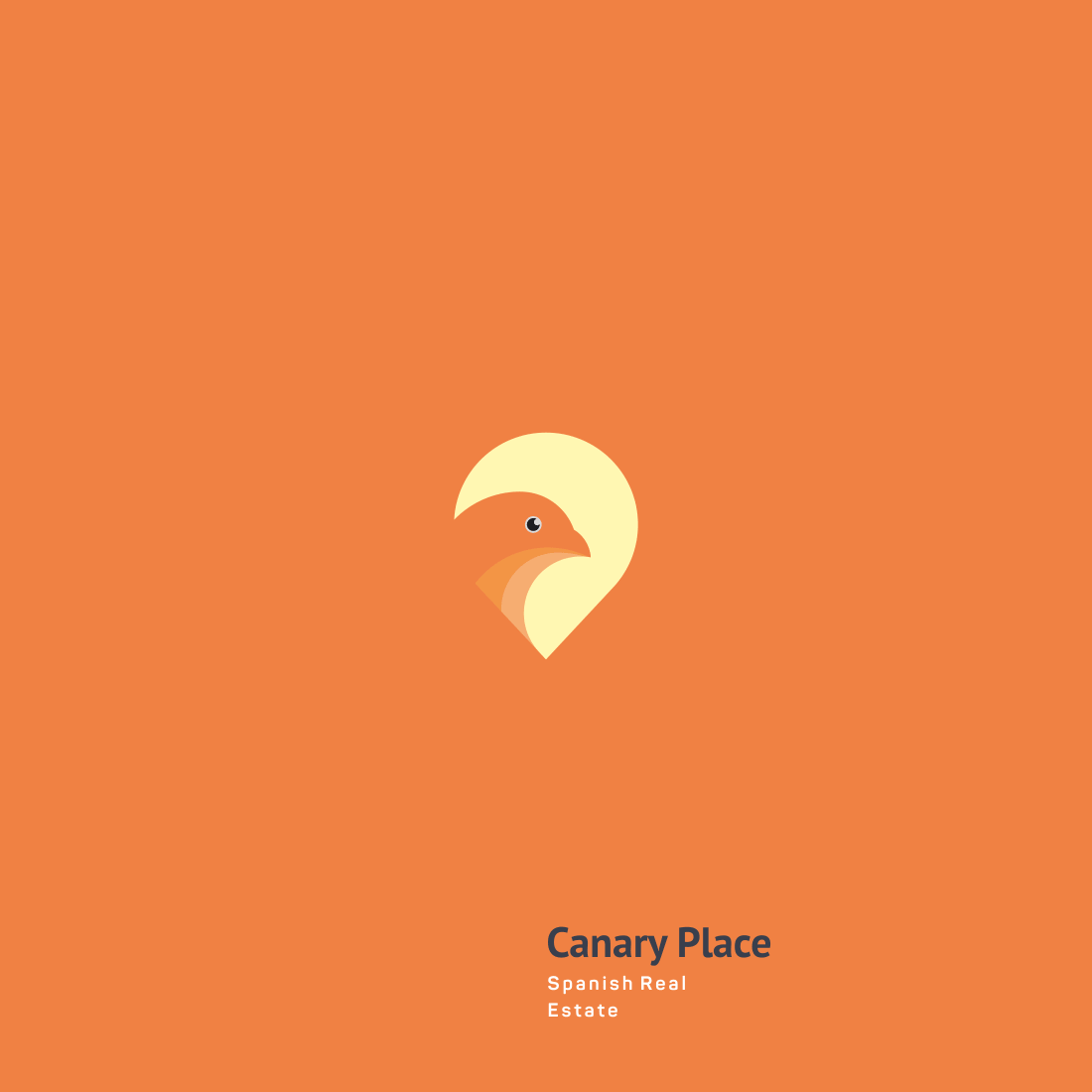
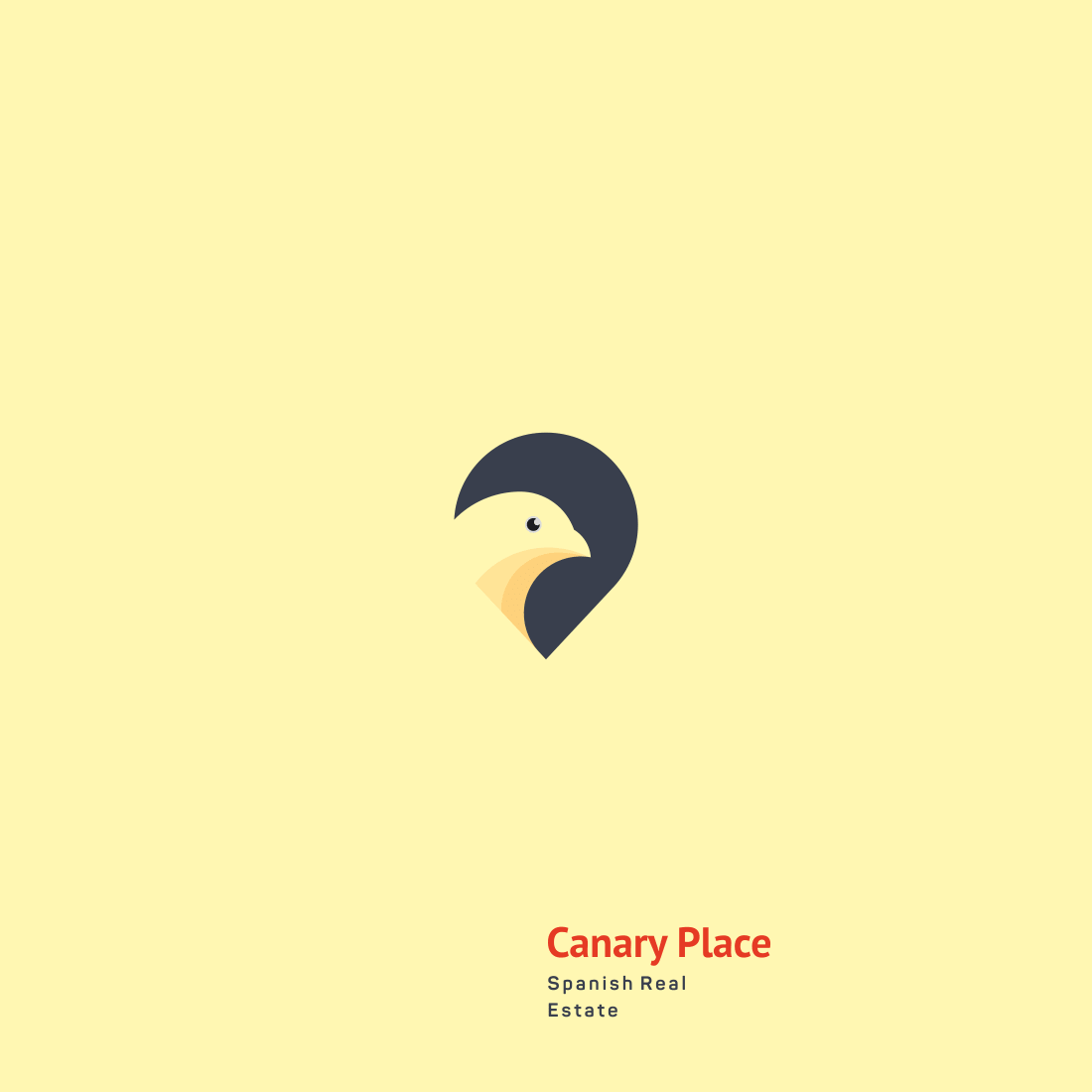
Canary Place


About
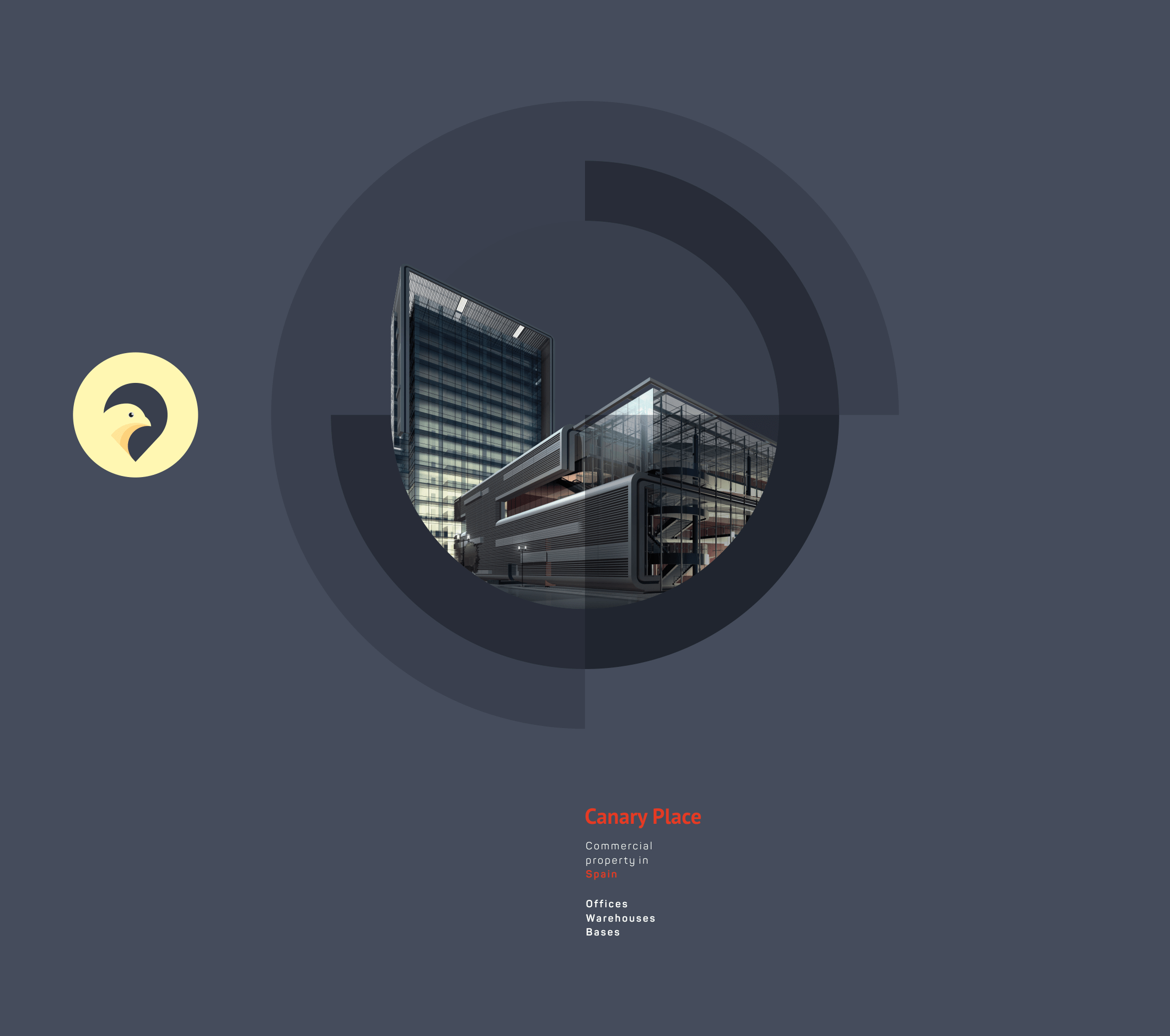
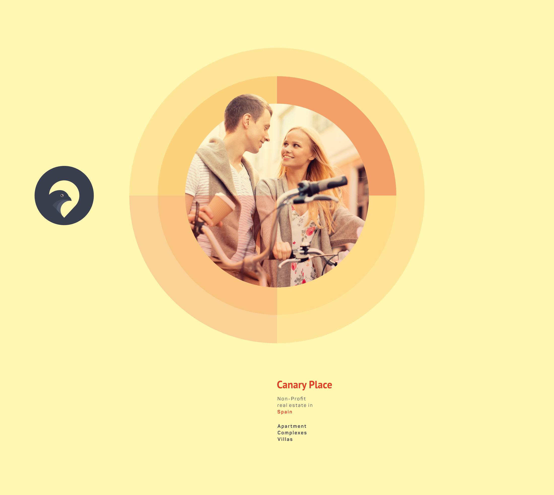
Want to buy or rent an apartment, house, office, warehouse in Spain?
Canary Place is a convenient service that will help you to achieve your goals, as well as assist in all legal issues related to the purchase and sales of real estate abroad.
We have developed the logo concept for a website on searching for real estate in Spain.
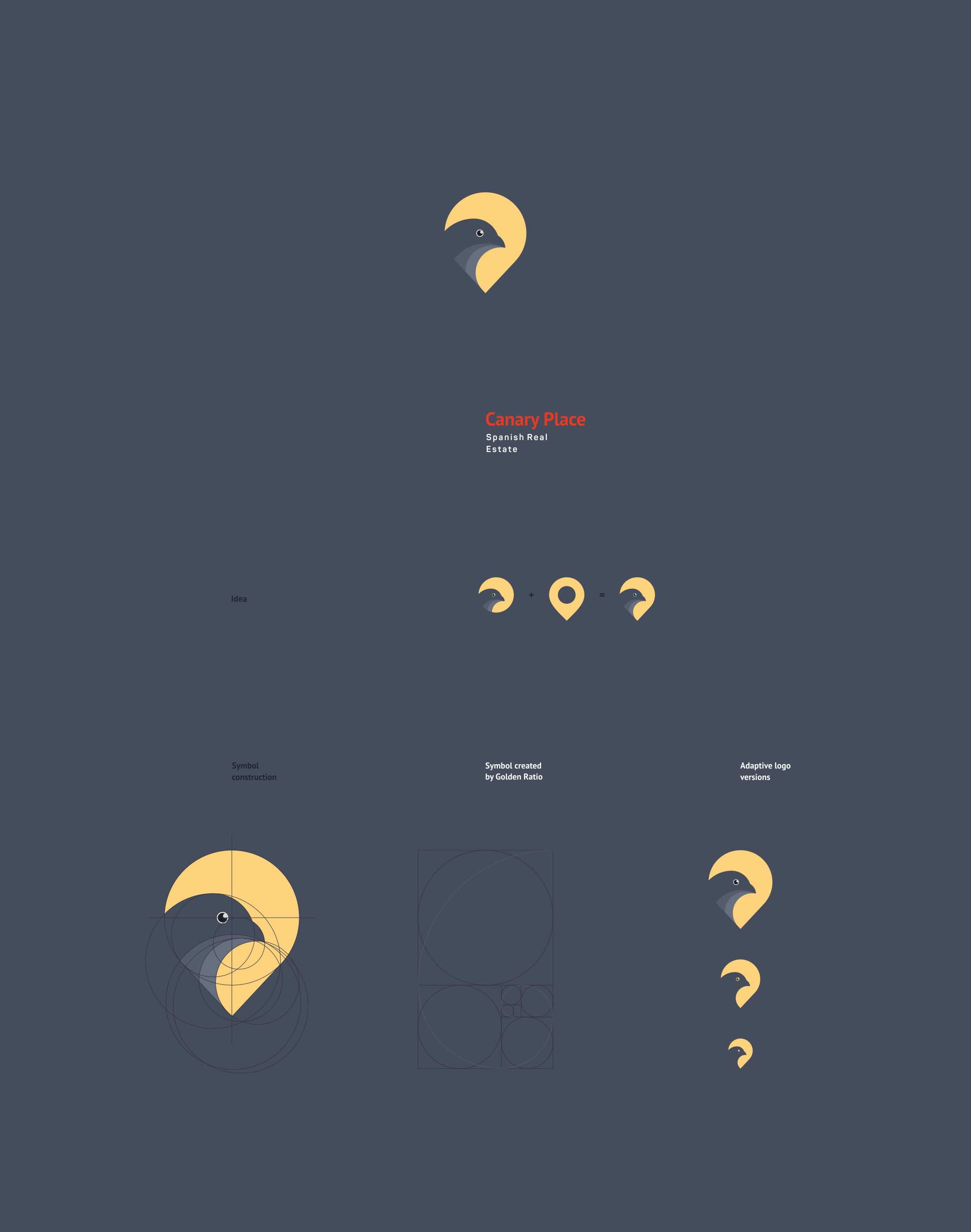
In the basis of the logo we laid the idea coming from the name itself, introducing the silhouette of a canary in the form of the symbol «location» by using the negative space, mostly expressed in adaptive monochrome versions of the logo.


In the creation of the symbol, proportions of the Golden Ratio were used, which gives it an aesthetic appearance and the correct ratio of all elements.
And for better visual perception, with the necessity to reduce the logo, we have created an adaptive version, which gives the best readability to the sign.
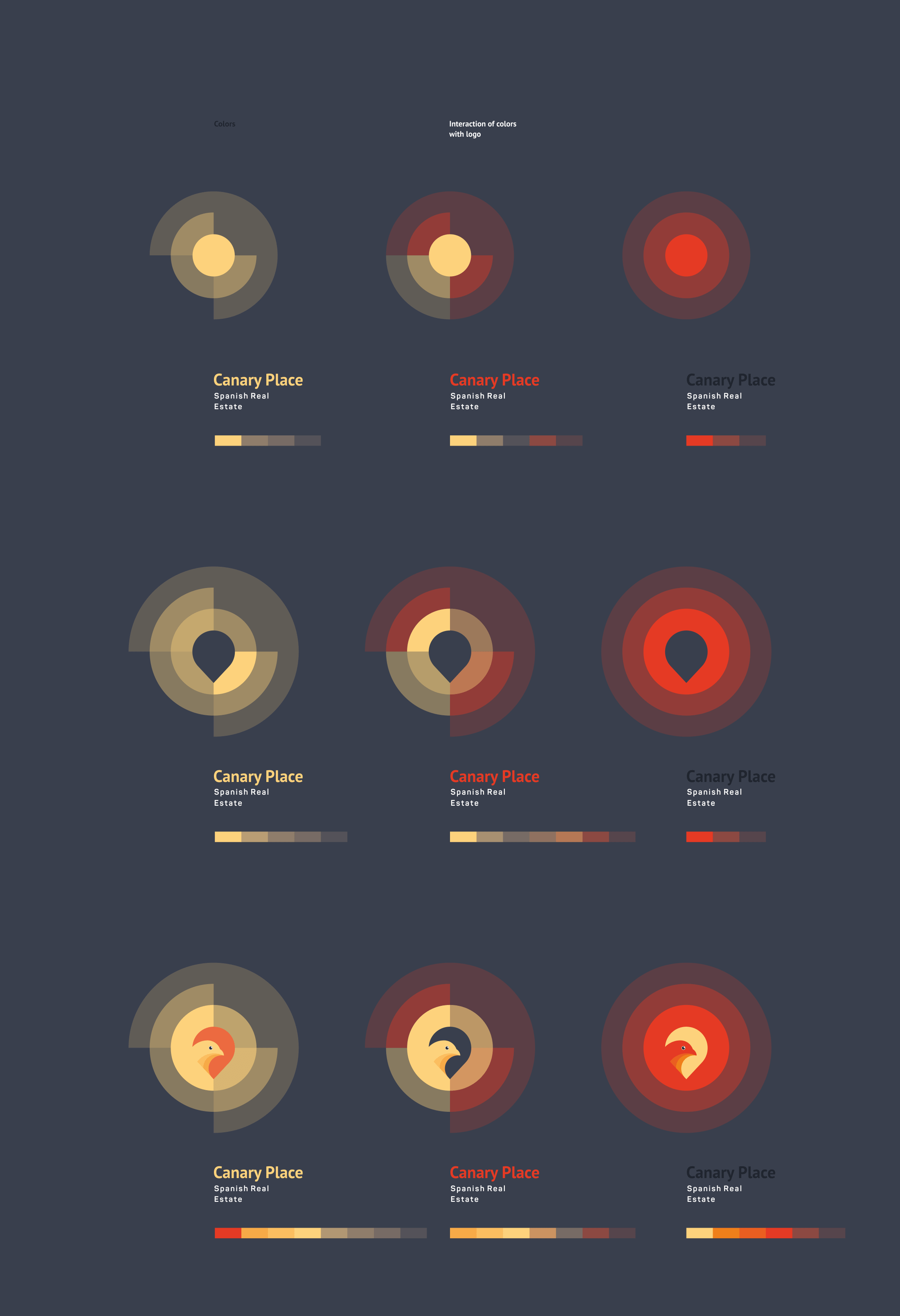


The result of the work was the demonstration of the logo on the prototype of the main page of the site, created specifically to demonstrate its interaction with color and graphic content in the required environment.
for watching!

